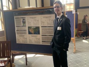
 Griffin O’Neill, a senior with a double major in Economics and Geography, presented a poster visualizing data on the topic of National Football League (NFL) Attendance and Anthem Protests in 2016.
Using the ArcGIS, software, Griffin plotted a base map representing the Standard Metropolitan Statistical Area (SMSA) of each NFL stadium and the change in home game attendance between the 2015 and 2016 seasons. Then in separate maps he overlaid on the base map the number of player anthem protests for each team, the number of police shootings of unarmed black men in the SMSA of the home team, and voting results in the 2016 Presidential election in the counties comprising the SMSA of the home team.
The poster was part of an independent study project conducted with Prof. Oskar Harmon.
 Professor Oskar Harmon has been named a University Teaching Fellow by the Center for Excellence in Teaching and Learning:
 Oskar Harmon and Paul Tomolonis (UConn PhD 2017) have co-authored the article “Learning Tableau – A data visualization tool”, published in the Journal of Economic Education.
 The Social Science Research Network (SSRN), a platform for dissemination of early-stage research, recently announced their all-time top ten downloaded papers in the topic Data Visualization. Oskar Harmon’s paper “Learning Tableau: A Data Visualization Tool” with Steven Batt, and Paul Tomolonis was among that list.